01The challenge
A view like this deserves more than a phone number.
People choose a mountain escape on a phone, late, scrolling between tabs. Apuseni Peak Paradise had the rare part sorted — two architect A-frames, a jacuzzi open to the ridgeline, a sauna, a glass-walled pavilion for a hundred guests. What it didn't have was a way to turn that late-night scroll into a confirmed, paid booking without handing 15–20% to a listing platform on every stay.
So the site had to do two jobs at once. Look premium enough to justify the price in three seconds — and quietly run like a reception desk underneath: two cabins on one calendar, seasonal rates, minimum stays, a card payment, an invoice, a confirmation email. All without a full-time booking manager, and all editable by the owners themselves.
02What we delivered
A cabin site that takes its own bookings
We built a light, image-led site that leads with the thing people are buying — the A-frame framing the valley, the jacuzzi under an open sky, the sauna, the terrace. Clean typography, fast on a phone, and honest about what each cabin is. Underneath it, a real reservation engine: a live availability calendar, rates that shift by season and weekday, packages and coupons, minimum-stay rules, and payment by card or bank transfer.
Then we did it again. Through August and September 2026 the site was rebuilt page by page around one shared design system and a single hero component — so the homepage, both landing pages, both cabins, the gallery, the rates page and the reservation flow now speak with one voice instead of nine. Every page carries a booking card above the fold, and the whole thing still runs on Elementor Pro, so the owners change a price, block a weekend or add an offer themselves.
03The result
- DirectBookings taken on-site — no 15–20% platform commission
- 0 manualConfirmation, payment and invoice raised automatically
- 3 pagesSite, ad landing page and events page — one design system
- PassedCore Web Vitals on phone, measured on real visitors
The owners list two cabins, set their seasons and watch the calendar fill — the site takes the booking, the card and the invoice on its own. Every direct reservation is one the platforms don't get to tax, and the whole thing stays theirs to edit.
Case study · Web design & booking · Romania
Apuseni Peak Paradise
Two A-frame cabins, one booking engine
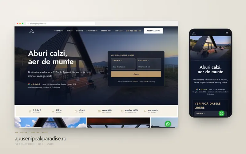
High in the Apuseni Mountains at 917 metres, Apuseni Peak Paradise rents two design A-frame cabins — Black Wolf and Savage Samurai — with a jacuzzi, a sauna and a valley that runs to the horizon. The stay sells itself. What it needed was a site as considered as the cabins, and a booking engine that takes the reservation, the payment and the invoice while the owners sleep. Cittago designed and built both — then, through August and September 2026, rebuilt the whole thing again.
- Client
- Apuseni Peak Paradise
- Location
- Sălciua, Apuseni Mountains · 917m
- Platform
- WordPress · Elementor Pro
- What we delivered
- Site + booking engine
- Services
- The site
- apusenipeakparadise.ro
The project, in three steps
The challenge, what we delivered and the result


Before / after
The same two cabins. A different business.
Drag the handle. On the left is the site as it was; on the right is the same page after the 2026 rebuild. Nothing about the property changed — only what a visitor meets in the first three seconds, and how far they are from a confirmed booking.

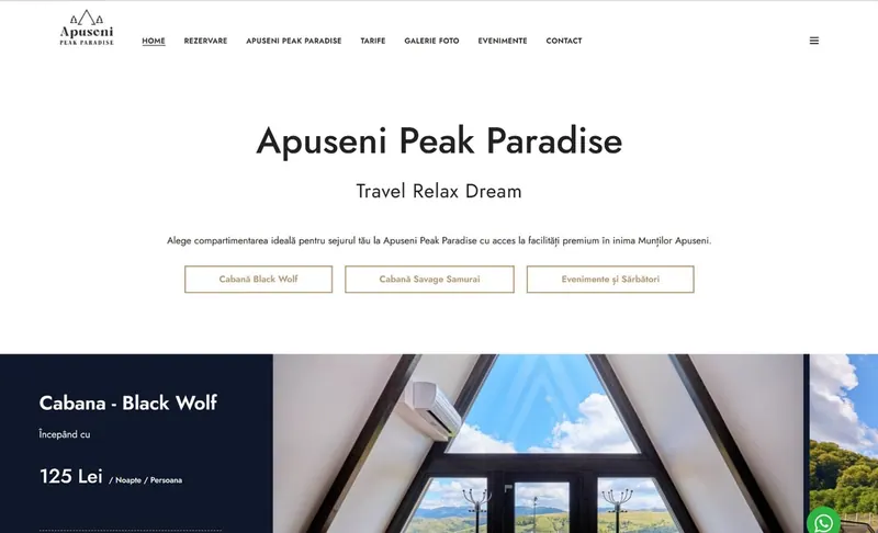
A brochure became a reception desk: the first screen now answers "what is this" and "is it free on my dates" at the same time.
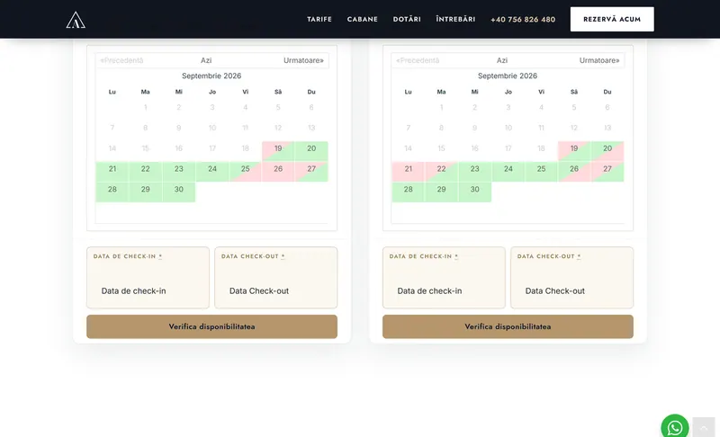

The old calendar showed one cabin at a time, so a weekend where Black Wolf was taken read as "no" even with Savage Samurai free. Both are on screen now — and the nightly price it used to print had already been overtaken by the real tariff.
The "before" frames are the screenshots we published about this project in August 2026, before the rebuild. We kept the originals rather than reconstructing anything, and cropped both halves identically — a comparison is only worth making if both sides are real.
Three surfaces, three jobs
One property, three ways in.
A cabin rental does not have one audience. Someone who searched your name wants to browse; someone who clicked an ad wants a price; someone planning a wedding wants to know whether a hundred people fit. Each gets its own page, and each page is built for the question it is actually being asked.
Nine pages, one design system
The rebuild put every page on the same foundation: one hero component, one navigation, one set of colours and one typeface served from the server rather than fetched from Google. Change the header once and it changes on the homepage, both cabins, the gallery, the rates page, the reservation flow and both landing pages.
That sounds like housekeeping. It is really what makes the site cheap to run: a price change or a new photo is one edit, not nine, and nothing drifts out of style between them.
- A single shared hero across nine page types — promise, trust strip and booking card can never drift apart
- An availability search above the fold, searching both cabins at once
- Rates, photo slider and video reel as global templates — edited once, updated everywhere
- Fonts served locally, so no third-party request blocks the first paint

/lp — built for a click someone paid for
Paid traffic does not browse. It arrives with one question and a very short temper, so the landing page is stripped to the shortest honest path: what this is, what it costs, is it free, book it. The navigation scrolls to sections on the same page instead of sending anyone away, and the availability calendars for both cabins sit side by side, so nobody has to check them one at a time.
It shares the site's design system, so it never feels like a page from somewhere else — but it is a separate page with a separate job, and the owners can clone it for the next campaign without a developer.
- In-page navigation — no exits from a page you paid to land on
- Both cabins' live calendars side by side, not one at a time
- 30% deposit, card confirmation in 2–3 minutes
- Clonable on Elementor Pro for the next offer

/lp-evenimente — a second business on the same mountain
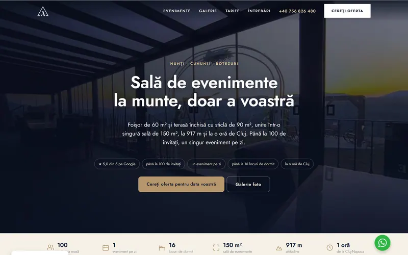
The property has a 60 m² pavilion and a 90 m² glass-walled terrace that join into one 150 m² hall. That is a wedding venue hiding inside a cabin rental, and it was invisible to anyone who wasn't already a guest. So it got its own landing page, with its own headline, its own proof and its own enquiry form.
The offer is deliberately legible: the whole location for a weekend, both cabins included, plus a flat amount per guest. No hall hire, no per-hour clock, no corkage. One event per day, which is the actual selling point — you are not sharing the mountain with anybody.
- Up to 100 guests, one event per day
- 60 m² pavilion + 90 m² glass terrace = a 150 m² hall
- 16 beds on site, so the party does not have to drive home
- Weddings, civil ceremonies and christenings, each addressed by name
The reservation engine
A booking system, not a booking form.
Behind the calendar sits a full reservation engine — rates, rules, payments and paperwork, automated end to end. Everything a busy host needs, and nothing they have to think about.
Rates & availability
- Live availability calendar
- Season-based dynamic pricing
- Weekday & weekend rate rules
- Promotional packages
- Discounts & discount coupons
Stay rules
- Minimum-stay limits
- Mandatory check-in days
- Mandatory check-out days
- Per-cabin availability control
- Blocked & special dates
Payments
- Pay by bank transfer
- Pay by card online
- A 30% deposit or the full amount
- Just 1% fee on card payments
- Auto-generated reservation code
Automation
- Automatic email confirmations
- Proforma invoice on transfer
- Fiscal invoice on card (SmartBill)
- Guest & booking records in one place
- Seamless updates, resilient under load
Payments & invoicing
Paid and invoiced, automatically.
- 1%
The lowest card fee we could source
Just 1% on every online card payment — so more of each booking stays with the host, not the processor.
Invoiced by SmartBill
The booking engine is wired to SmartBill: every paid reservation raises the right document with zero manual work.
Proforma or fiscal — automatically
A bank transfer raises a proforma; a card payment raises a fiscal invoice on the spot. The guest gets it by email; the books stay clean.
A deposit holds the dates
Guests pay 30% to confirm and settle the rest on arrival — the system tracks the balance through to check-in.
A closer look
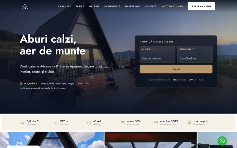
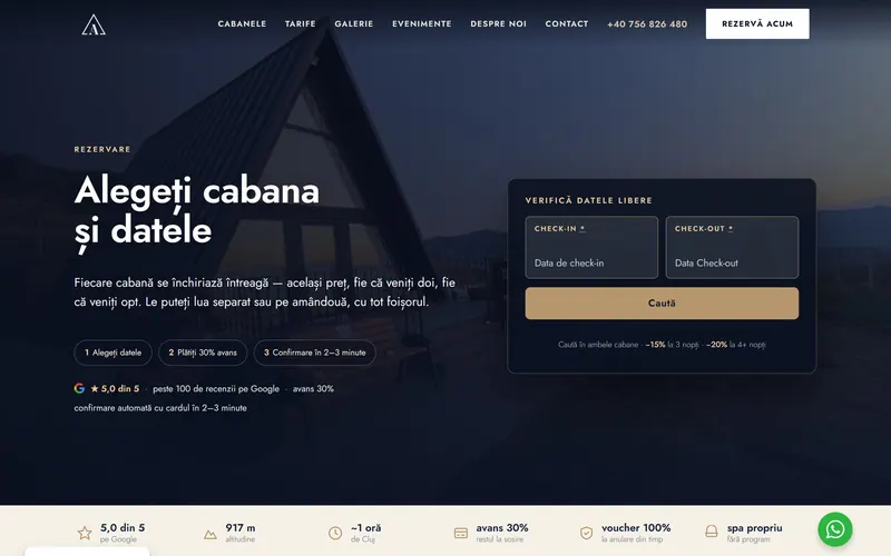
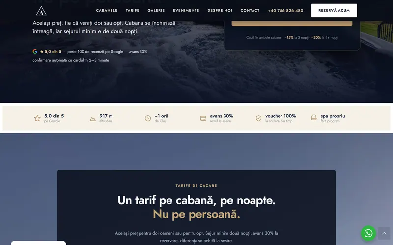
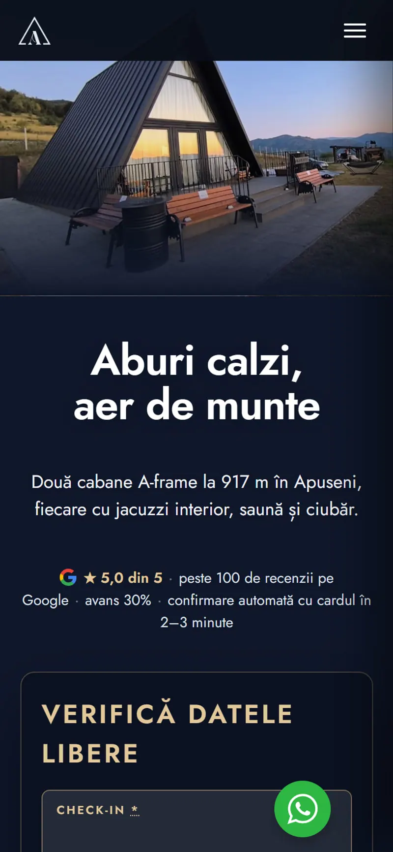
The rebuilt site, page by page
Every frame below is a screenshot of the live site, captured at the width it was designed for — not a mockup.





The clips
Some things a photograph cannot sell.
A still frame can show you a hot tub. It cannot show you steam coming off the water at 917 metres, or the swing moving, or the light at seven in the morning. So the site carries six short vertical loops, shot on a phone and cut to a few seconds each — the same six that run on the landing page.
They are free until you want them: every clip is poster-first and preload="none", so scrolling past this section downloads 0 bytes of video. Press one and only that one loads. All six together are 4.1 MB — more than this entire page — which is exactly why they are not loaded for people who never press play.
Measured on real visitors
Core Web Vitals: passed.
These are not lab numbers. Each one is the 75th percentile of what actual visitors to apusenipeakparadise.ro measured on their own phones over a 28-day window — the same field data Google uses when it ranks the site. We publish the thresholds next to the values so you can see how much room is left, including where there isn't much.
Core Web Vitals assessment · phonePassed
LCPLargest Contentful Paint — when the main image finished loading
1.7 sgood up to 2.5 spoor from 4.0 s
84% of visits are in the good band.
INPInteraction to Next Paint — how fast the page answers a tap
195 msgood up to 200 mspoor from 500 ms
Inside the threshold, but only just — this is the one we are still working on.
CLSCumulative Layout Shift — how much the page moves under your thumb
0.10good up to 0.10poor from 0.25
Sitting exactly on the line. Worth watching after every photo change.
FCPFirst Contentful Paint — when anything appeared at all
1.2 sgood up to 1.8 spoor from 3.0 s
83% of visits are in the good band.
TTFBTime to First Byte — the server's own response time
0.8 sgood up to 0.8 spoor from 1.8 s
A shared-host ceiling as much as a code one.
Source: the Chrome UX Report, 28 days to 17 September 2026, phone form factor, 75th percentile. Desktop is not shown because the site does not receive enough desktop traffic for Google to report a figure — which is itself the answer to "which device should we design for". We deliberately do not quote a PageSpeed performance score: it is a lab simulation, and we have watched the same URL score 60 and 96 within an hour.
The build
Run by the people who run the place.
The site isn't a brochure someone else has to maintain. It's built on Elementor Pro — so the team changes a price, swaps a photo or adds a package themselves, in minutes, with no developer on call.
1Edit without code
The whole site is visual and drag-and-drop — text, photos and prices change in minutes.
2One design system
Colours, fonts and spacing are global; set once, they stay consistent on every page.
3Reusable templates
Headers, footers and layouts are built once and reused, so nothing drifts out of style.
4Truly responsive
Separate desktop, tablet and phone controls mean it looks right on any screen.
5Popups built in
Seasonal offers, newsletter capture and notices without bolting on extra plugins.
6Dynamic content
Room data, rates and availability pull in automatically instead of being retyped.
7A lean widget library
Sliders, galleries, forms and maps are native — fewer plugins, less to break.
8Fonts served locally
The typeface ships from the site's own server, so no third-party request delays the first paint.
9Fine layout & motion
Subtle animation and pixel-level control, all without touching code.
10Cheap to change
The most-used builder on the web, so tweaks are quick and inexpensive — from us or any developer.
What the client says
We had the cabins and the view, but Cittago gave us the perfect digital “reception”. They created a premium, ultra-fast website for us that handles everything on its own: live calendar, automatic invoicing and card payments (only 1% commission instead of 15–20% on platforms). The best part? We edit it ourselves in a few minutes, without depending on anyone. […] Honestly, I have rarely dealt with such a professional and dedicated company.
What we wrote back
Thank you so much, Viorica, for these words! We are so happy that the automatic booking and invoicing system makes your daily work easier and that you felt the difference compared to the high commissions of the platforms. That is exactly what we set out to do: a site that you can control yourself, without dependencies. We are glad that you felt the attention to detail and availability put into every stage of the collaboration — it was a pleasure working together and we can't wait to see your cottages grow!
What we used
The services behind this project
The next project could be yours
The first meeting is free and lasts 30 minutes: online, by phone or, if you are in Cluj, over a coffee. Tell us what you want to build, and we will tell you honestly what would work.
Prefer a message? You can reach us on WhatsApp, by email or by phone and we will reply directly.
No preparation and no follow-up pressure. If we are not a good fit, you leave with better questions to ask whoever comes next.