
Case study · Rebuild & conversion · Italy

Fumostop, rebuilt

The same promise, on a site that loads before you can doubt it

We had already designed and built fumostop.it once, on WordPress, and it worked. Then we took it apart and built it again — this time as a static Astro site, with the copy rewritten around one question a smoker actually asks, a free 60-second test that gives something away before it asks for anything, and a landing page for the ads that never sends a paid click anywhere but forward. It went live on 1 September 2026.

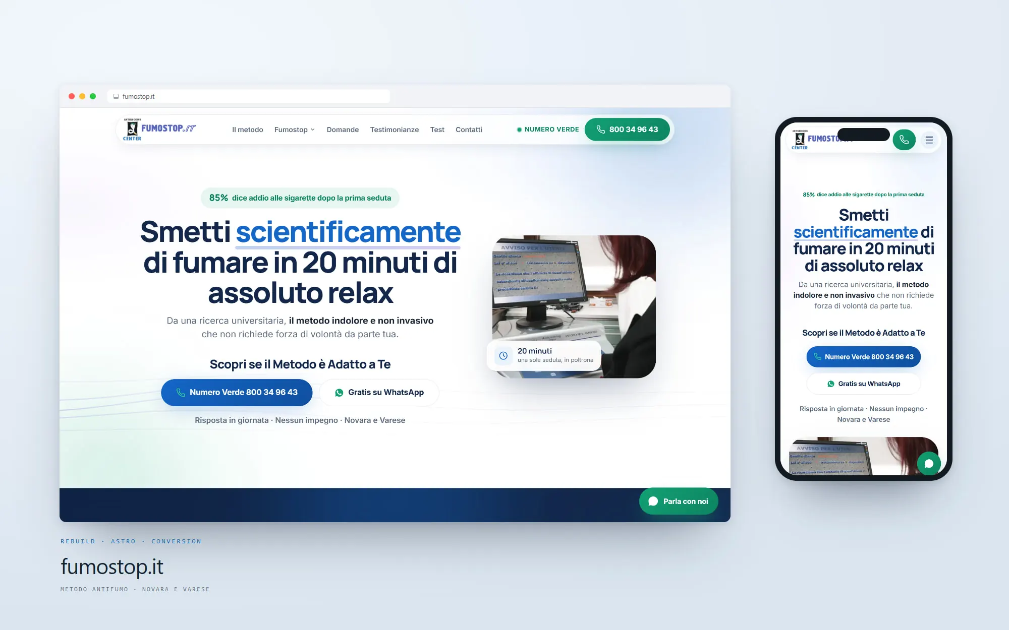
fumostop.it after the 2026 rebuild — the Astro site on desktop and mobile
Client
Fumostop — Antismoking Center
Type
Rebuild · Astro · Conversion
Location
Novara & Varese, Italy
Platform
Astro · static
Live
fumostop.it ↗

The challenge

The first site worked. That is exactly why rebuilding it was hard.

Rebuilding something broken is easy — anything you do is an improvement. Rebuilding something that already converts means every change has to earn its place, and the failure mode is subtle: a prettier site that quietly performs worse, with no way to tell until the phone stops ringing.

So the brief was not "make it nicer". It was: say the one thing a smoker is actually weighing, in the first three seconds. Give the undecided visitor a reason to raise their hand before they are ready to book. Stop making paid traffic and organic traffic read the same page when they arrived with different questions. And ship it on something that loads in a second on a phone in a car park, because that is where these decisions get made.

What we rebuilt

Three doors, one method

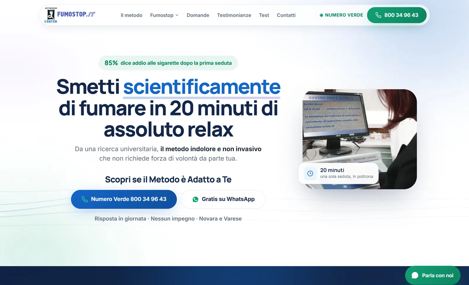
The headline changed from a claim to a mechanism: not "free yourself from cigarettes" but "stop smoking scientifically, in 20 minutes of complete relaxation". A promise invites doubt; a mechanism invites a question. Under it sits the part that used to be buried — the university research, the guarantee, what the session actually is — and the two ways to reach a human, the freephone number and WhatsApp, are on screen from the first pixel.

Then we split the traffic. The site is for people who searched and want to read. The landing page is for people who clicked an ad and want an answer. And the test is for the third group nobody was serving: the ones who are curious but not ready, who will happily spend sixty seconds on a quiz and would never have called. The whole thing was rebuilt as a static Astro site — no database, no plugins, no admin to keep patched — and every page ships as a file.

Before / after

Same method. A different first sentence.

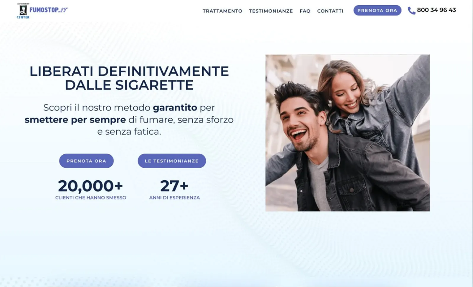
Drag the handle. On the left is the site we built first; on the right is the same page after the 2026 rebuild. The clinic, the method and the guarantee did not change — what changed is what a visitor is asked to believe in the first three seconds.

The rebuilt homepage — the mechanism in the headline, a photograph from the real clinic, the freephone number and WhatsApp side by sideThe previous Fumostop homepage — a stock photograph of a laughing couple, a claim in capitals and two indigo buttons
The homepageThe old page asked you to believe a claim. The new one tells you how the thing works, shows the room it happens in, and puts a phone number and a WhatsApp thread where the second button used to be.

The "before" frame is the screenshot our first Fumostop case study still runs today — cropped out of its mockup so both halves are page pixels at the same scale.

How it is built

Four audits, two devices.

Lighthouse · 19 Sep 2026

Google's Lighthouse grades a page on four axes. Three of them — accessibility, best practices and search-engine readiness — are rule-based: they check contrast ratios, alt text, a valid canonical, a correct heading order. They do not move between runs. Performance is different: it is a simulation of one load on a throttled connection, and it does swing, so we print the date we measured it.

Mobile

  • 98Performance
  • 100Accessibility
  • 100Best practices
  • 100SEO
FCP
1.1 s
LCP
1.7 s
TBT
160 ms
CLS
0

Desktop

  • 100Performance
  • 97Accessibility
  • 100Best practices
  • 100SEO
FCP
0.2 s
LCP
0.4 s
TBT
40 ms
CLS
0.009

Measured on the homepage with the PageSpeed Insights API on 19 September 2026. We publish the desktop accessibility score as the 97 it is rather than rounding it up, and we are not claiming a Core Web Vitals pass here — that is field data from real visitors, it is measured over 28 days, and this site has only been live since 1 September. Run it yourself

In practice

What the rebuild changed

01

From WordPress to static

No database, no plugin stack, no admin login to defend. Every page is a file on disk, served as it is.

02

Copy rewritten around a mechanism

"Stop smoking scientifically, in twenty minutes" replaces a claim with something a sceptic can interrogate.

03

A lead magnet that gives first

A six-question test returns a personalised report by email, and only asks for a call if the visitor wants one.

04

Paid and organic split apart

A noindex landing page for the ads, with its own thank-you pages, so campaign conversions stay separable.

05

Accessibility taken seriously

100 on mobile — contrast, focus order, labels and landmarks, not an afterthought bolted on at the end.

06

Italian, end to end

Every page, every form, every validation message and every confirmation — written, not machine-translated.

Three doors

One method, three ways in.

Someone who searched your name, someone who clicked an ad, and someone who is merely curious are not the same visitor — and a single page cannot answer all three without becoming vague. Each one now has a surface built for the question it is actually being asked.

The method page on the rebuilt fumostop.it, explaining the twenty-minute session step by step

The method, on its own page instead of buried in a scroll

The site

Thirteen pages, each answering one objection

The old site put the method, the price, the guarantee and the proof on one long scroll. The rebuild gives each its own page — the method, the university research, the guarantee, what it costs, the testimonials, the questions — so a visitor can go straight to the thing stopping them instead of hunting for it.

That is also why the pages are small. A page that answers one objection does not need to carry the whole argument, and the site now ships between 23 and 35 KB of HTML per page, with no database, no plugin layer and nothing to keep patched.

  • Thirteen pages in the sitemap, one objection each
  • Static Astro — no database, no plugins, no admin surface
  • 23–35 KB of HTML per page
  • Freephone number and WhatsApp on screen from the first pixel
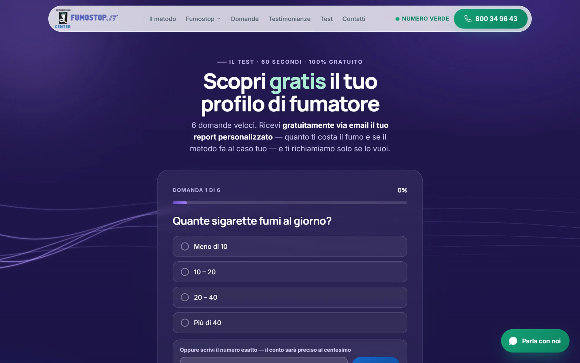
The free test on fumostop.it — question one of six, with a progress bar and an exact-number field

Question 1 of 6 — and a field for the exact number

The free test

/test — something given away before anything is asked

Most visitors are not ready to book. They are ready to find out. So the rebuild added a six-question test that takes about a minute and ends with a personalised report by email: what the habit is costing them, and whether the method suits their profile. The first question is how many cigarettes a day — with an exact-number field, because a smoker who types 23 has already started doing the arithmetic on themselves.

It is a fair trade, and it is deliberately not a trap. The report arrives whether or not they want a call, and the page says so before the first question. What it buys the clinic is a conversation with the two-thirds of visitors who would otherwise have left without a trace.

  • Six questions, about sixty seconds, free
  • A personalised report by email — the cost of the habit, and whether the method fits
  • "We only call you back if you want us to", said before question one
  • Its own thank-you page, so the completion is measurable
A section of the Fumostop ads landing page, with the guarantee and the proof laid out for paid traffic

The landing page — same system, shorter road

The landing page

/lp — where the paid click lands

Search traffic wants to browse. Paid traffic wants an answer, and every exit from the page is money already spent. So the landing page carries the same design system and the same proof, but its navigation scrolls to sections on the same page instead of sending anyone away, and it is deliberately kept out of the search index — it exists for the ads, not for Google.

It also has its own thank-you pages. That sounds like housekeeping; it is what makes the ad account able to tell a booking that came from a campaign apart from one that came from a search, instead of crediting everything to whoever was last to touch it.

  • In-page navigation — no exits from a click you paid for
  • noindex on purpose: the ads own this page, not the search results
  • Its own thank-you pages, so campaign conversions stay separable
  • The freephone number and WhatsApp repeated down the page
The contact page on the rebuilt fumostop.it, with a short enquiry form in Italian

Contact — the lighter of the two hands to raise

The forms

Booking and contact, two roads to the same diary

There are two ways to raise a hand: book a slot, or ask a question first. The rebuild keeps them separate, because collapsing them into one form makes the hesitant visitor click nothing at all. Booking is a short form on its own page; contact is a lighter one for people who are not there yet.

Each lands on its own confirmation page. So the clinic can see how many people asked versus how many booked — a distinction that was invisible when everything ended on the same generic thank-you.

  • Separate booking and enquiry forms, separate confirmations
  • Italian throughout, including every validation message
  • A freephone number for the ones who would rather just talk
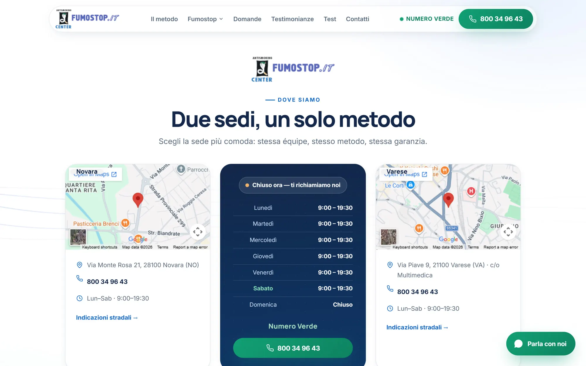
  • Novara and Varese, both stated up front

A closer look

The rebuilt site, page by page

Every frame below is a screenshot of the live site at the width it was designed for — not a mockup.

The rebuilt fumostop.it homepage
The homepage — the mechanism, not the claim
The proof section of the rebuilt homepage
Proof placed where the doubt is, not on a page of its own
The research page on fumostop.it
The university research, given its own page
The pricing page on fumostop.it
What it costs — answered, not deflected
The testimonials page on fumostop.it
Testimonials, as a page people actually reach
The thank-you page after completing the free test
After the test — the report, and only then an offer
The booking page on fumostop.it
Booking — short, and on its own page
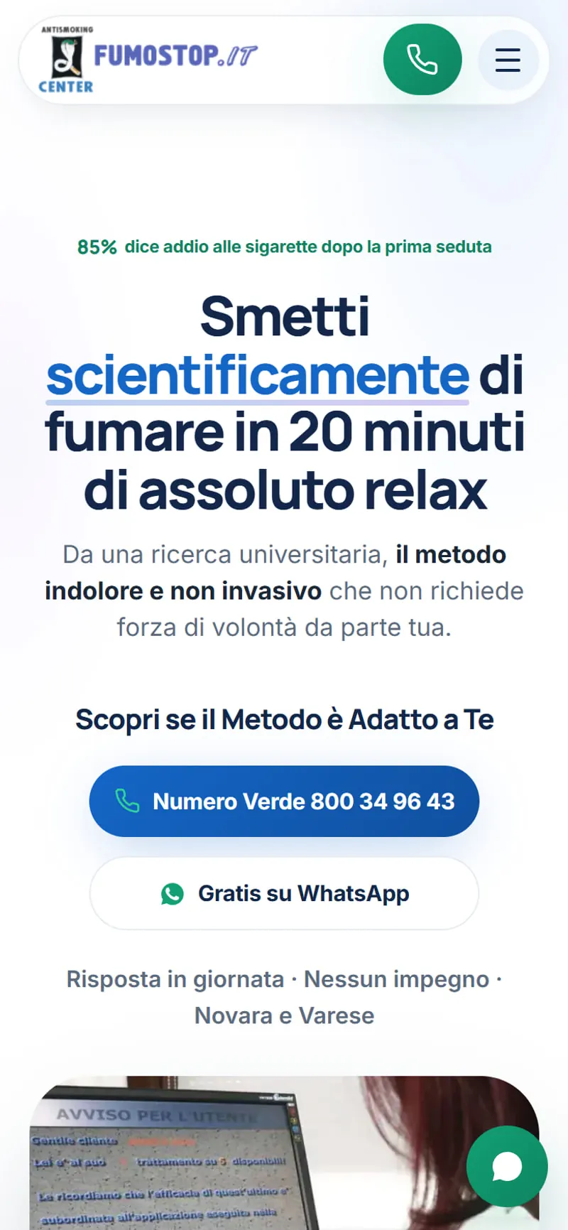
The rebuilt homepage on a phone
On a phone, where the decision is usually made
The free test on a phone
The test on a phone — one question per screen

The outcome

100

Accessibility, best practices and SEO on mobile — rule-based audits, not a simulation

23–35 KB

Of HTML per page, static, with no database behind it

3 doors

Site, ad landing page and free test — one method, three ways in

1 Sep 2026

Live, rebuilt page by page with the old site never down

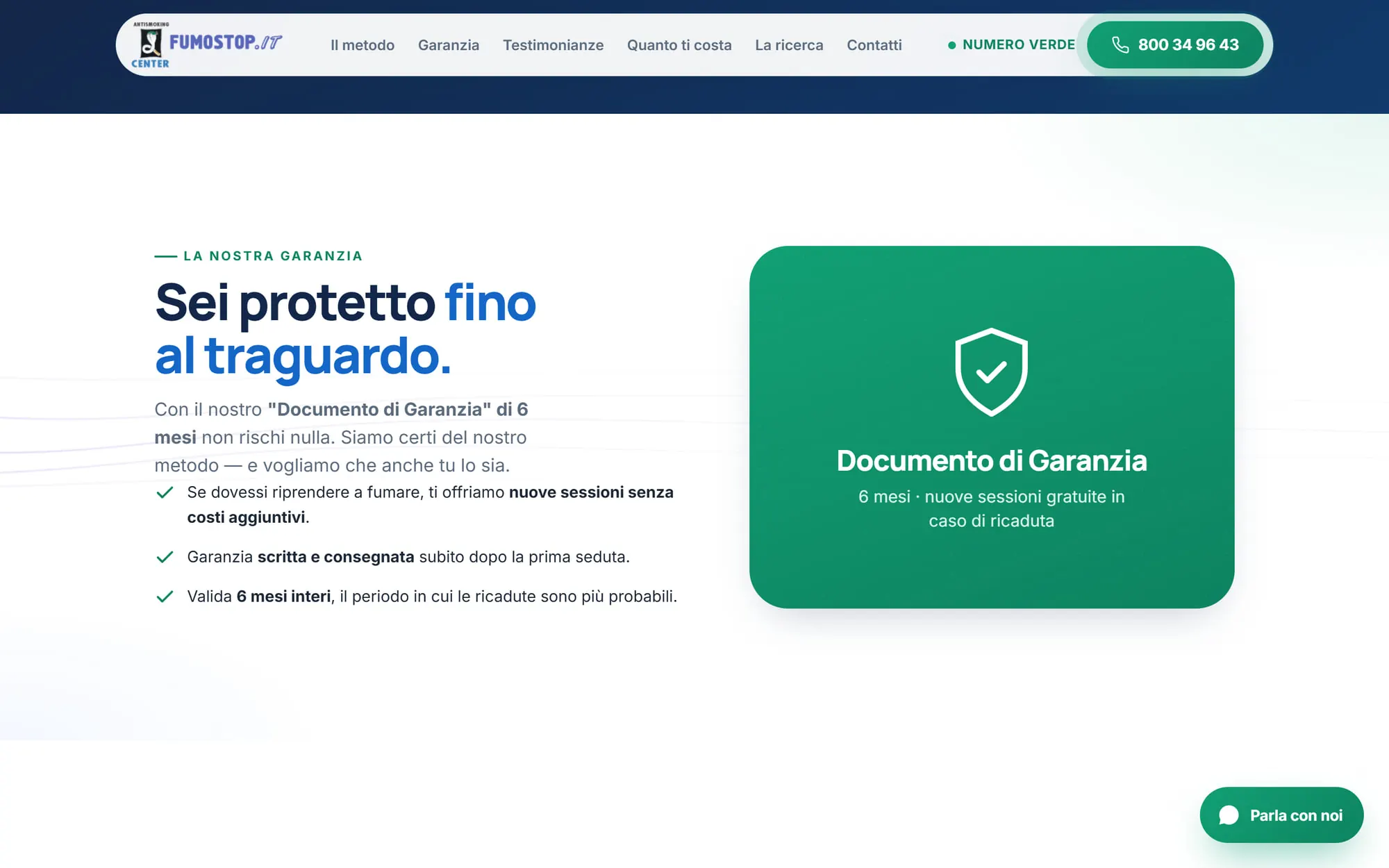
The clinic kept the thing that was working — the method, the guarantee, twenty-seven years of it — and changed what a stranger meets in the first three seconds. The site now answers the sceptic, gives the undecided a reason to raise their hand, and sends the paid click somewhere built to receive it.

How we work

Four steps, every time.

01

Discovery call

Thirty free minutes to understand the business, the market, and where the money actually leaks.

02

Custom strategy

A plan built around the one metric that matters — not a template, not a channel checklist.

03

Implementation

Senior hands build it: campaigns, pages, tracking — the whole funnel wired as one system.

04

Monitor & optimise

We watch the numbers every week and cut what doesn’t pay, so results compound instead of fading.

A fair first step

Is your site the reason people hesitate?

Thirty minutes with a senior strategist, no script and no pitch. We'll look at what your first three seconds actually say, and sketch what we'd change first — yours to keep, whoever builds it.

Request the free analysisNo obligation and no chasing afterwards. If we're not the right fit, you'll leave with better questions to ask whoever is.

15 years · 5.0 on Google · 56 brands · 11.4× average return on ads · 6 countries

·First paint — when something appeared·Server response — before anything could load·Page ready — when you could interact
Page loaded in ·